


3 scores max per player; No foul language, show respect for other players, etc.
Name | Score | Date | ||
|---|---|---|---|---|
| 1 | ||||
| 2 | ||||
| 3 | ||||
| 4 | ||||
| 5 | ||||
| 6 | ||||
| 7 | ||||
| 8 | ||||
| 9 | ||||
| 10 |
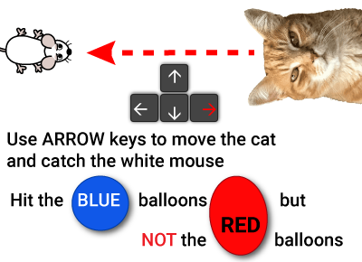
Game: CAT AND MOUSE
Aim: Catch the white mice
Method:
Move the cat with the arrow keys or by tapping in the game area to catch the white mouse. Avoid the red balloons but hit the blue balloons.
Your final score is based on all of that plus number of questions answered right, and the time taken.


Sasha 🫥
"Describe the translation: right and up"
The CAT AND MOUSE game to practice
'Polarity, strength of correlation' for 8th grade
8th grade / Statistics / Two variables / Scatter graphs / Polarity, strength of correlation
Polarity and strength of correlation for scatter graphs
Scatter graphs use dots or diagonal crosses to represent values that correlate the relationship between two variables. The scatter graph will indicate the degree to which the two variables are correlated (linked or related).
For instance, a scatter graph plotting altitude (x-axis) against Oxygen concentration (y-axis) will indicate a strong correlation between these two variables because Oxygen concentration reduces with altitude (the reason climbers can suffer from altitude sickness). On the other hand, a scatter graph plotting eye colour against exam results will show no correlation because these two variables have no causal relationship.
The polarity of a correlation can be characterised as "positive" or "negative". This indicates whether an imaginary straight line drawn through the points (a line of best fit) rises to the right (positive - as the x-axis variable increases, so does the variable on the y-axis) or falls to the right (negative - as the x-axis value increases, the y-axis variable decreases). So, thinking about our example of altitude plotted against Oxygen concentration, we will see a negative correlation because the concentration decreases as the altitude increases. A positive correlation would be seen if we plotted a child's age against shoe size: as their age increases, so does their shoe size.
The strength of a correlation can be characterised as "strong" or "weak". A strong correlation will be indicated on a scatter graph by points that closely follow a line of best fit. A weak correlation will show points that are more loosely concentrated around a line of best fit.
In this topic you are asked to decide which of the descriptions provided best describe the correlation between the variables plotted on the x and y axes. The possible options are:
- Strong positive correlation
- Strong negative correlation
- Weak positive correlation
- Weak negative correlation
- No correlation
With our Cat and mouse math game you will be practicing the topic "Polarity, strength of correlation" from 8th grade / Statistics / Two variables / Two variables. The math in this game consists of 16 questions that ask you to identify the polarity and strength of any linear correlation for each of the given scatter graphs.

Cat versus mouse game with added balloons for math and fun. You are the ginger cat, and your life is being made a misery by some white mice which have come into the house and are proving hard to catch. Not to mention there is a mouse house party going on and lots of balloons getting in the way of your hunting.
So you have to catch the white mice, forget about the gray mice, hit the blue balloons but avoid the red balloons, and answer math questions (you are a CLEVER cat...). If it sounds complicated and a bit frantic, that's because it is. Do your best but don't worry if you can't catch all the mice - neither can we. It's a cat's life...
UXO * Duck shoot * The frog flies * Pong * Cat and mouse * The beetle and the bee
Rock fall * Four in a row * Sow grow * Choose or lose * Mix and match
Latest leaderboard entries: Cat and mouse


How to play CAT AND MOUSE to practice
'Polarity, strength of correlation' for 8th grade

CAT AND MOUSE is a quirky take on the perennial enmity of ponderous predator and plucky prey. Here are the basics:
- Press "PLAY" on the CAT AND MOUSE settings page to open the game.
- You are a ginger cat overwhelmed by a serious mouse problem.
- Luckily your job is only to catch the white mice, not all the mice.
- Trouble is, they are not easy to catch and will try to avoid you.
- Use the arrow keys or tap the screen in the direction you want the cat to go.
- You will need fast reaction times to catch those white mice, and the balloons keep getting in the way.
- Mouse scores are 25 points for each white mouse caught, minus 5 points for each white mouse that escapes.
- When you do catch a white mouse, a math question will appear.
- Answer the math question correctly for those extra points...
- You get 50 points for each correct answer, but you lose 25 points for each wrong answer.
- Hitting blue balloons gives you extra points, but 3 hits on a balloon will burst it for that level.
- Hitting red balloons takes away points.
- Balloon scores are +5 or +10 points for blue balloons, -5 or -10 points for red balloons.
- This is a timed game and your final score is calculated by taking away your time in seconds from the points you have earned.
- If you get one of the 10 best scores you can add your name to the leaderboard for your chosen topic.


